My Project Page
MSGT 2018-19
Below is an archive of past analysis and cartography.
As the MSGT projects or Capstone project
are either revised or completed, they will be posted below.
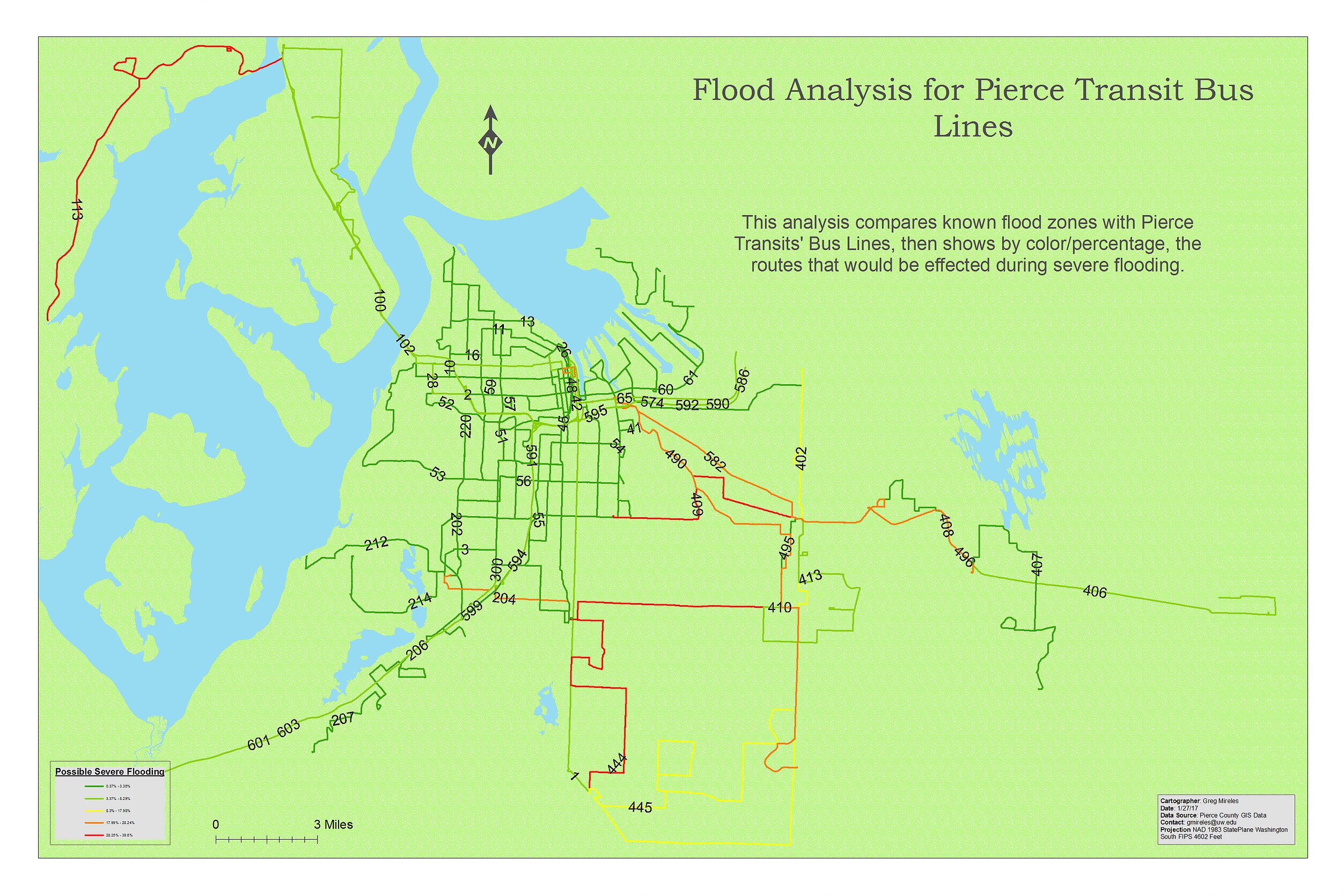
Flood Analysis
This is a flood analysis of Pierce County Transit bus lines that would be affected during severe flooding.
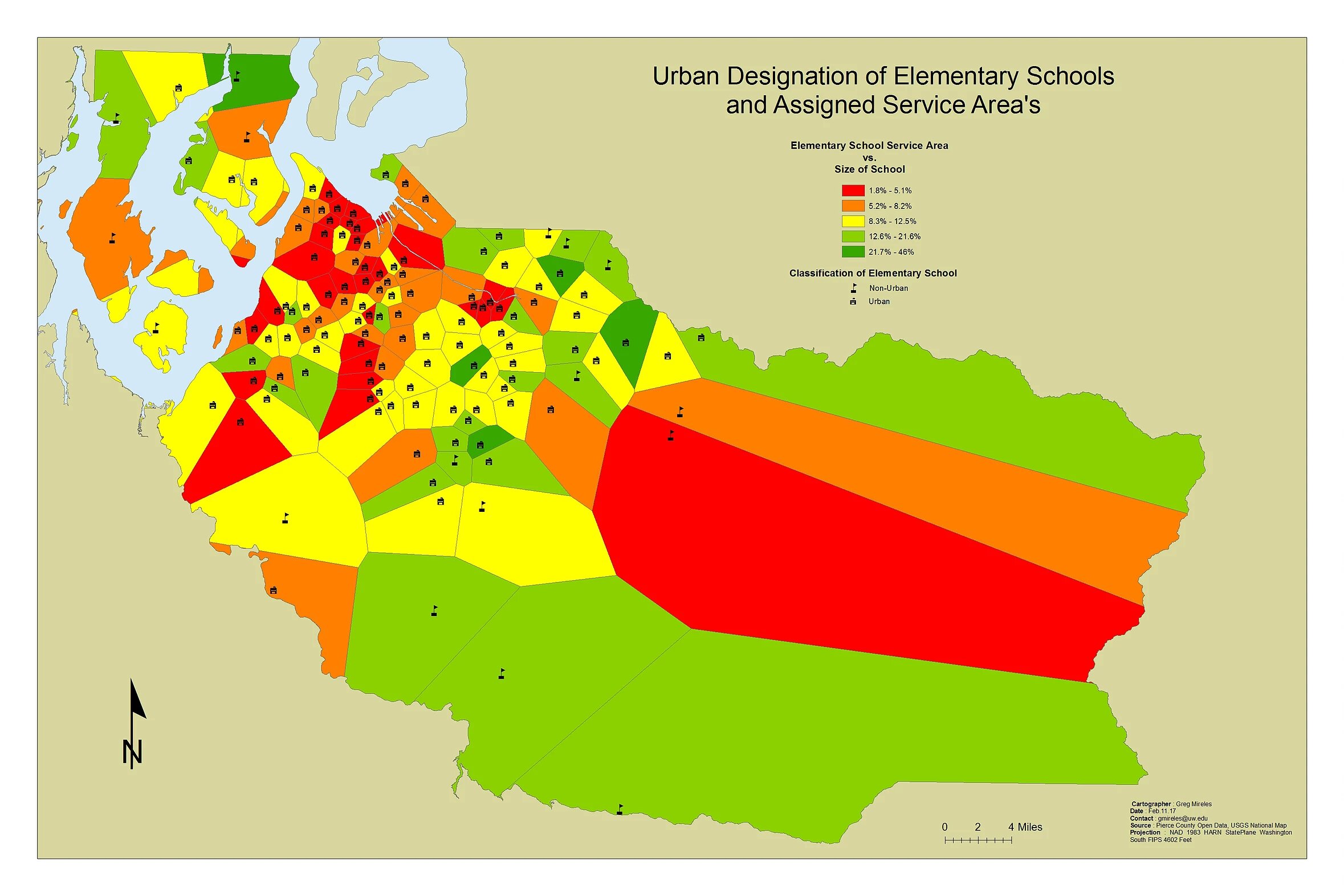
School Analysis
The map displayed, is the total area of each Pierce County elementary school campus. This is represented through colored polygons, which are estimate feeder regions for these schools. The feeder regions’ shapes, show the approximate area that each school serves, while their colors demonstrate the size of the schools’ campus. Thus, the reader can compare the physical size of the school to the estimated areas it serves. Lastly, each school has been designated as either “Urban” or “Non-Urban,” according to what the US Census Bureau considers each to be, by using population statistics.
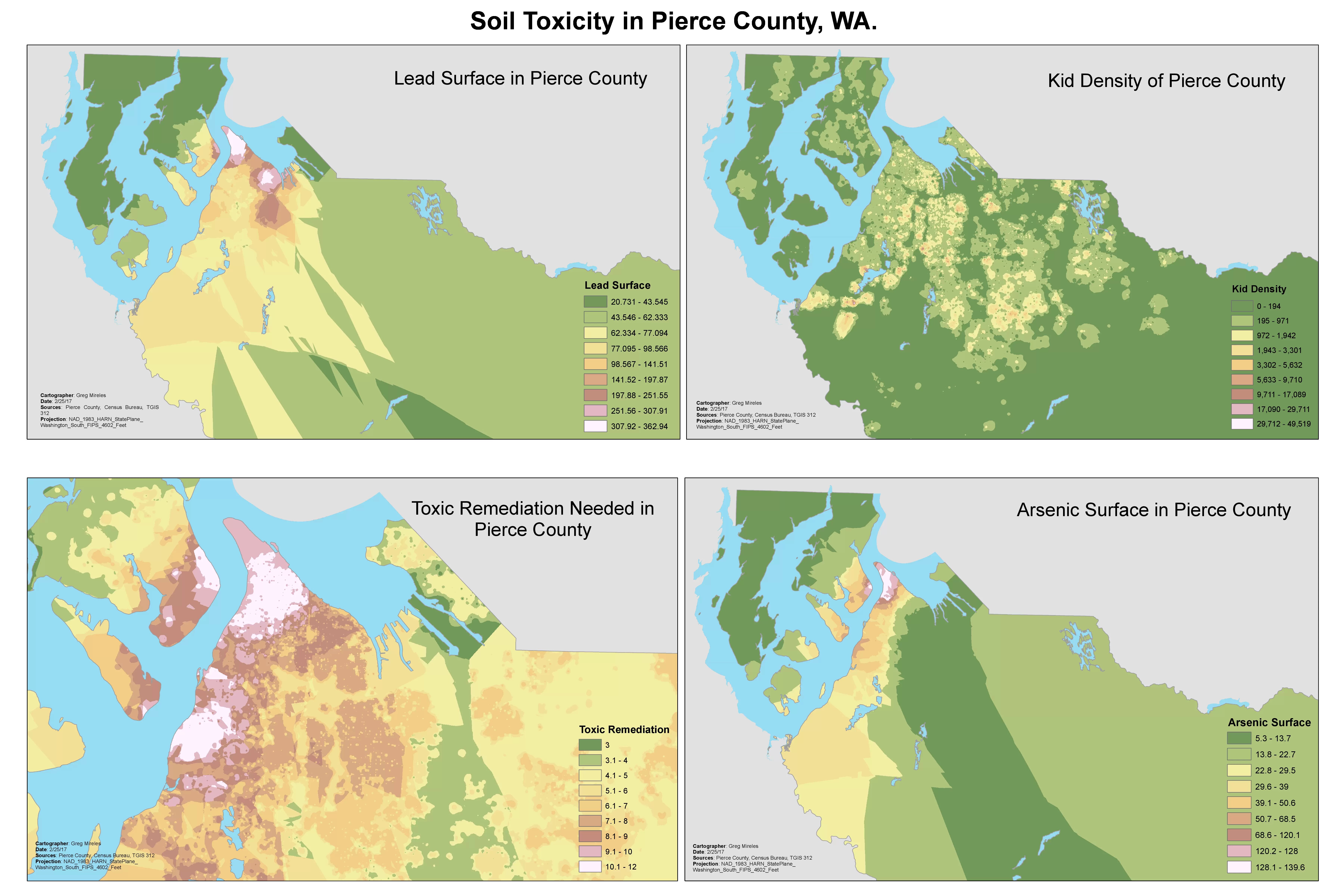
Toxic Analysis
This map document displays the levels of Lead and Arsenic in and around Tacoma, as well as a remidiation map that shows which surrounding areas still need to be treated. Also included is a map that shows the "Kid Density" of Tacoma, being as kids are more likely to interact with the dirt when outside playing.
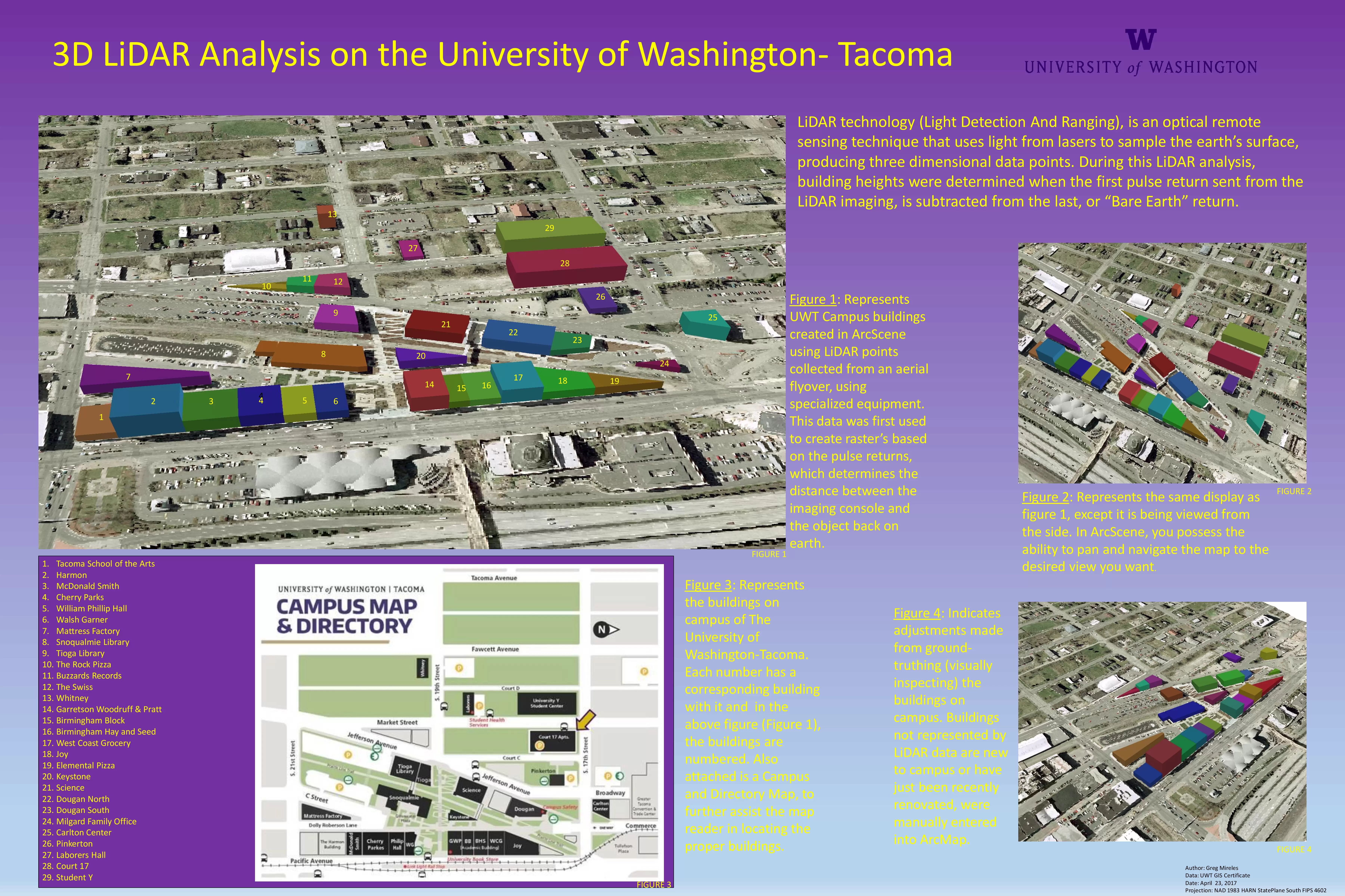
LiDAR Analysis
This map shows the University of Washington Tacoma campus visualized in a 3D format. This was done by collecting point clouds from specialized aerial imagery equipment. Once the point clouds were built and the buildings were displayed, I physically walked around the buildings to "ground truth" with a GPS. Once this was done, I was able to adjust the actual heights of the buildings to reflect the new data and the old data, to create an accurate 3D map of the buildings on Tacoma's campus, with proper heights and properly labeled. This analysis was completed using ArcScene.
Leaflet Map displaying Geojson Datasets
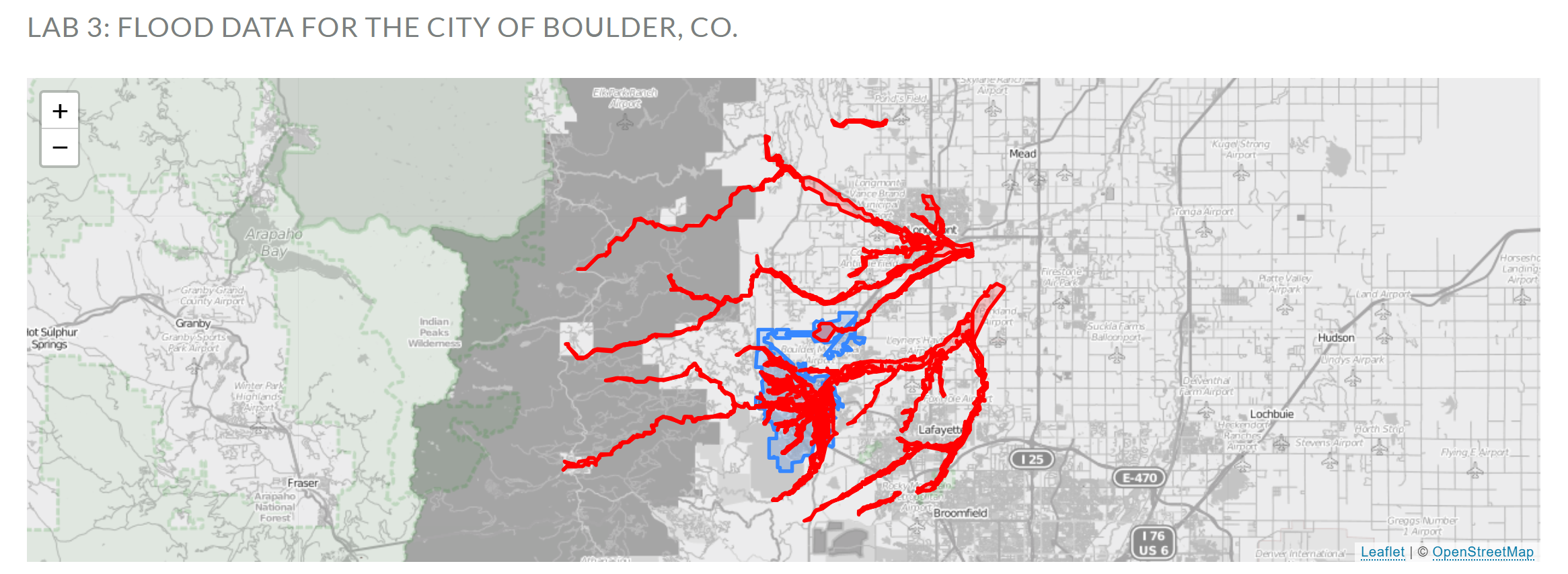
The map displayed is of Boulder, CO. The data on the map consists of two seperate layers, one is of the city limits, the other is Boulder County's Flood Zones. Overlaid, you can see where the admisitrative boundary of the city extends to, in conjunction with the know flooding zones. With this basic visual display, you can determine exactly where in the city flooding occurs, allowing you to make varying decisions based on this knowledge.
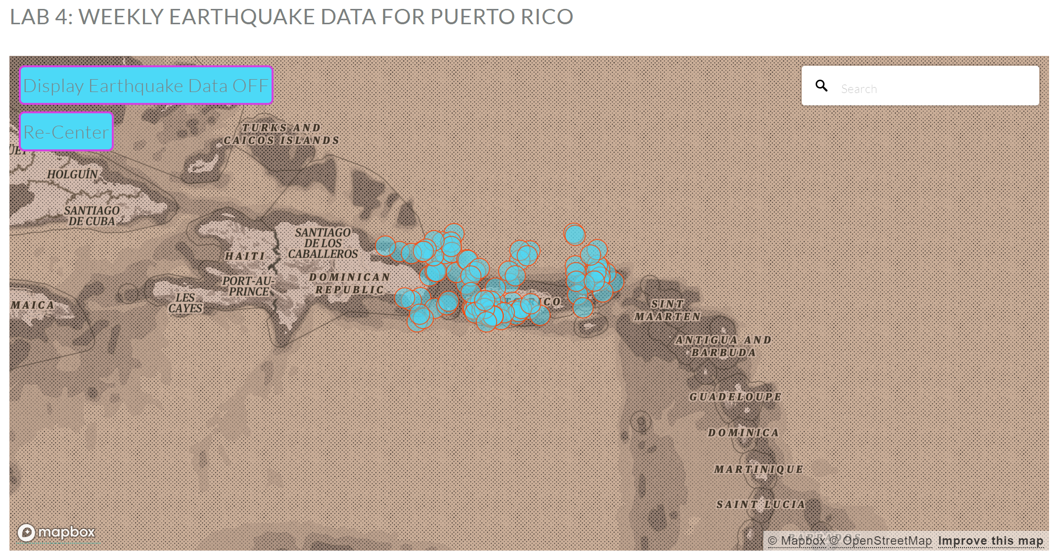
Live GeoJSON Data w/ Mapbox
This map consists of two maps: The top map is a Leaflet Map displaying GeoJSON data; The bottom map is a Mapbox map that is displaying live data for earthquakes that happened over a week in Puerto Rico. By clicking on the circles that represent each earthquake, you will see a pop-up which displays some information about each event.
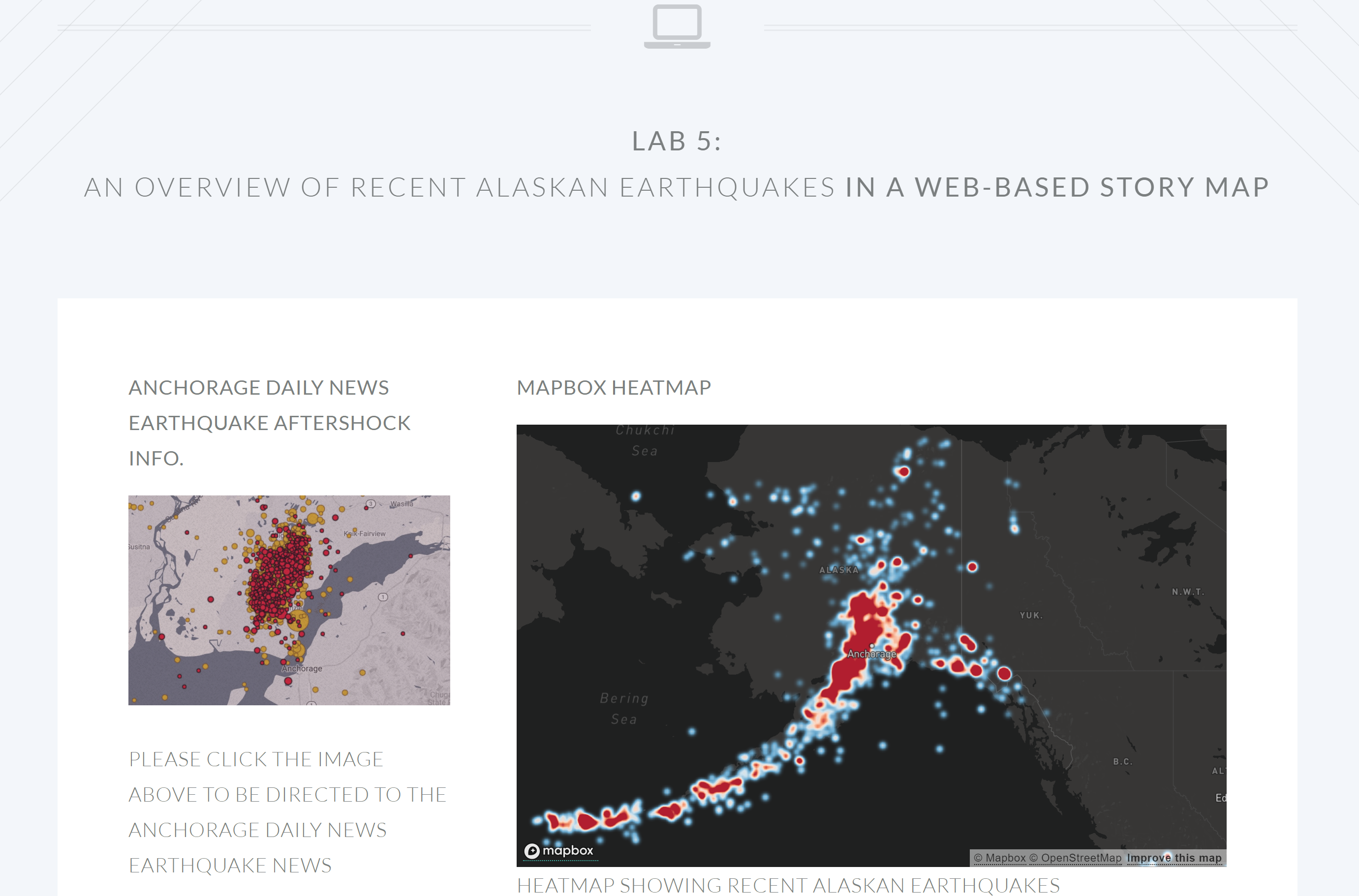
A Web-Based Alaskan Earthquake Story Map
This map consists of two Mapbox maps that display earthquake data. The top map is a heat map of all recent earthquakes in Alaska, while the second map is displaying all significant earthquakes around Anchorage, AK within the past month, using live GeoJSON earthquake data from the USGS.
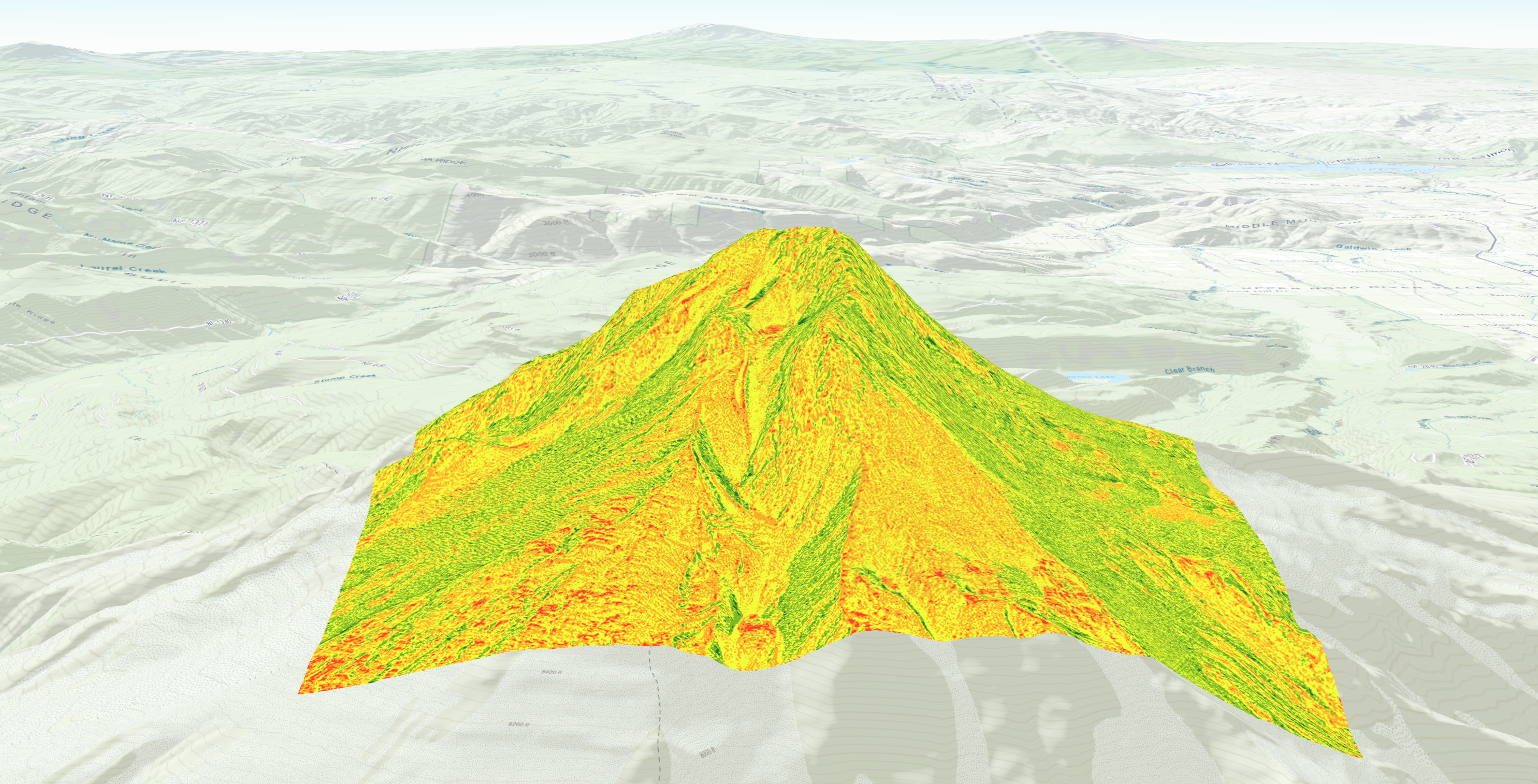
Avalanche Susceptibility of Mt. Hood, OR.
This lab consists of two 3D interactive online displays of LiDAR data that was used in the analysis of where avalanches are most likely to occur on Mt. Hood, OR., using advanced spatial modeling techniques which are described further by clicking the above image.